Built-in Widgets
The 11 SDK tool widgets that ship with @neeter/react and how to override them
neeter ships widgets for 11 Claude Agent SDK tools. They auto-register when you import from @neeter/react — just add tools to your SessionManager and the UI handles the rest.
What you get
Every built-in tool renders with three layers:
- Approval preview — when
permissionModerequires approval, the card shows what the tool is about to do (the file being edited, the command to run, the content being written) so the user can make an informed decision - Loading state — animated indicator while the tool executes
- Completed result — formatted output (diff views, code blocks, link pills, checklists)
The collapsed card header shows a rich label — the filename for file tools, the command for Bash, the search query for web tools — instead of the raw tool name.
Covered tools
File operations
| Tool | Approval preview | Completed result | Collapsed label |
|---|---|---|---|
| Read | File path | File content in monospace block | Shortened path |
| Write | File path + content preview | Content that was written | Basename |
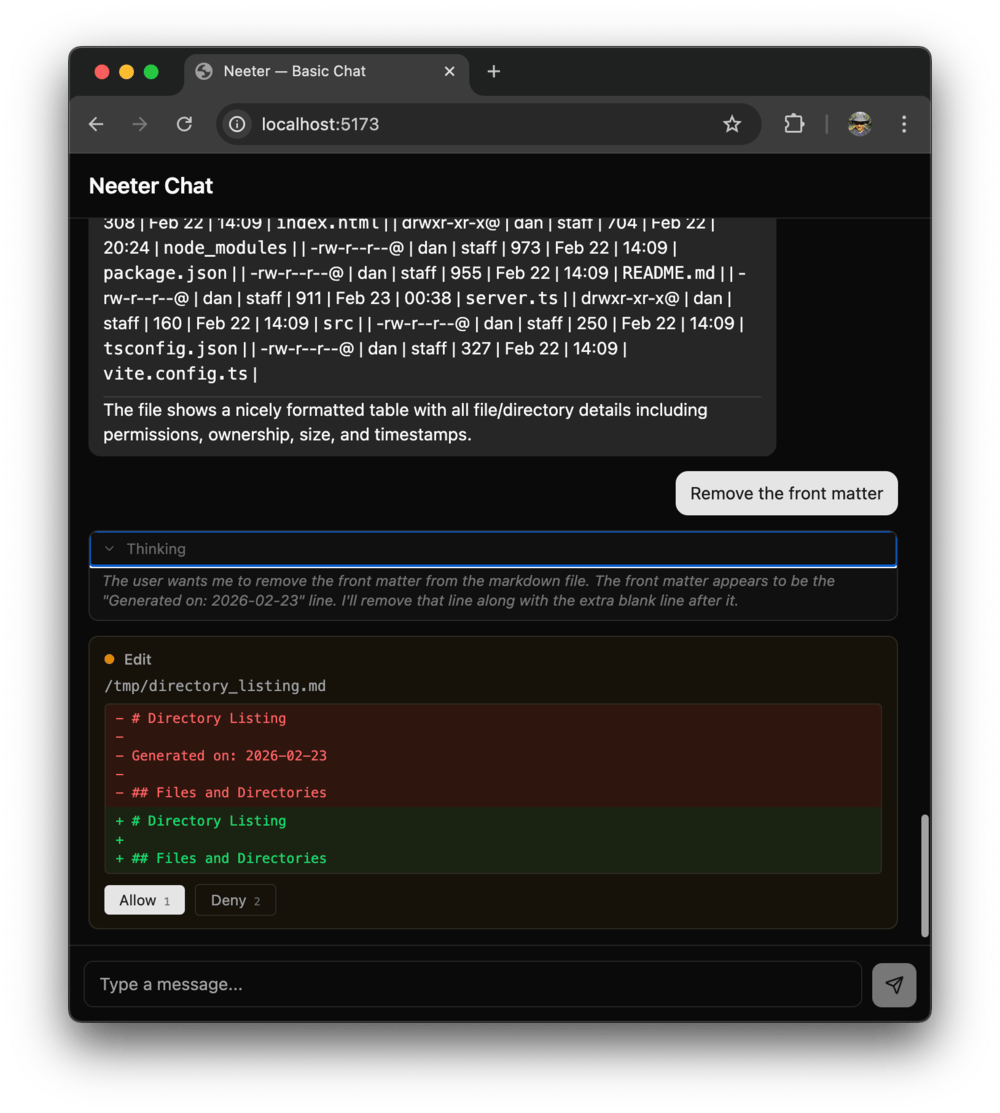
| Edit | File path + red/green diff of old → new | Confirmation message | Basename |
| Glob | Pattern + search path | Match count + file list | Pattern |
| Grep | /{pattern}/ + path, glob, mode | Search results in monospace block | Pattern + scope |
| NotebookEdit | Operation label, cell ref, code preview | Operation result + source block | [mode] filename |
The Edit widget is the most visually distinct — it shows a line-by-line diff with red/green highlighting so you can see exactly what's changing before approving.
NotebookEdit uses insert-aware cell labels: for insert operations, the cell reference shows "after cell-2" rather than just "cell-2" since the cell ID is the anchor point.
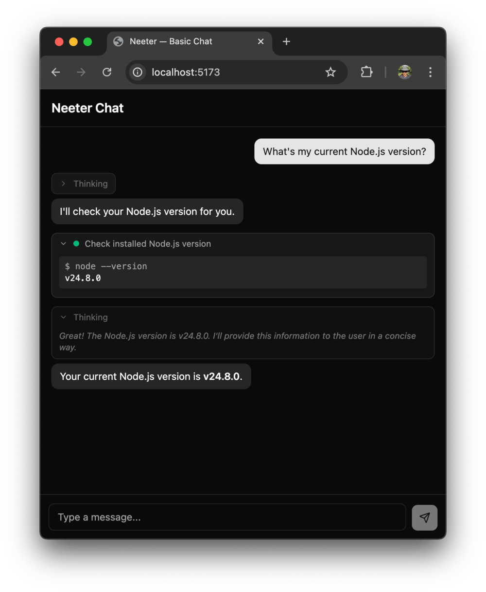
Command execution
| Tool | Approval preview | Completed result | Collapsed label |
|---|---|---|---|
| Bash | Description + command block | $ command + output | Description or truncated command |
Web
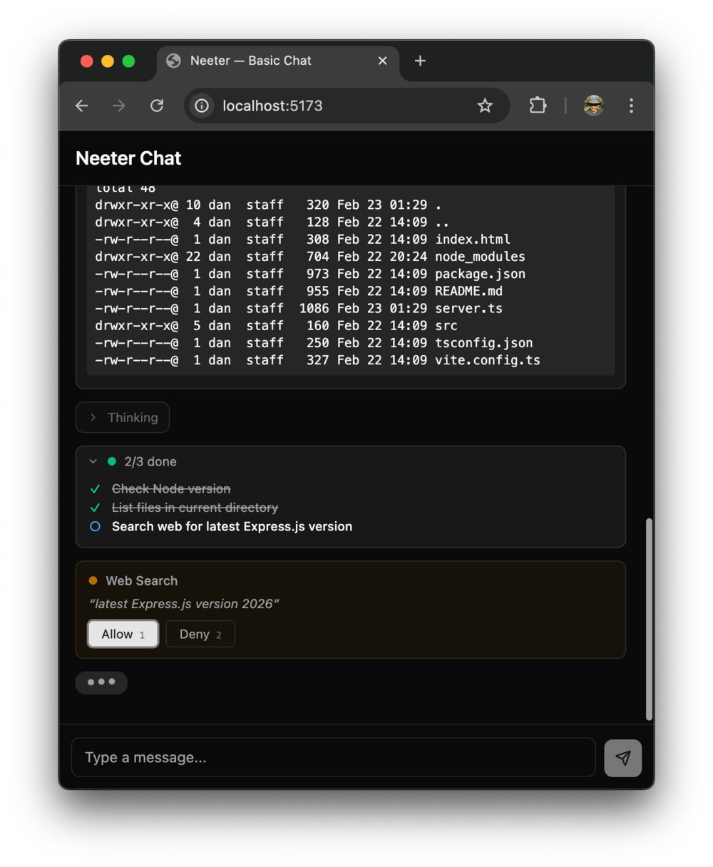
| Tool | Approval preview | Completed result | Collapsed label |
|---|---|---|---|
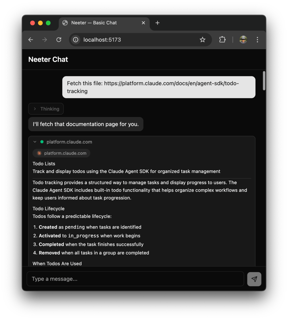
| WebFetch | Favicon pill + domain, prompt | Pill + markdown-rendered content | Domain name |
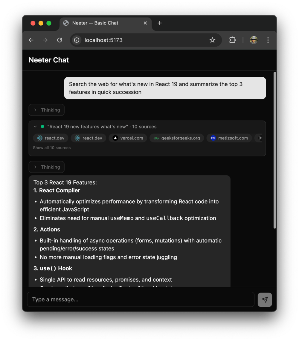
| WebSearch | Search query | Expandable grid of favicon + domain pills | "query" · N sources |
Agent interaction
| Tool | Completed result | Collapsed label |
|---|---|---|
| AskUserQuestion | Question/answer pairs | Header: Answer |
| TodoWrite | Checklist with status icons | X/Y done |
These two don't show approval previews since they don't go through the canUseTool flow.
Tools without widgets
Seven SDK tools intentionally use the default fallback — they produce plain text or are too niche.
| Tool | Reason |
|---|---|
| Task | Subagent results are plain text |
| Skill | Same as Task |
| ExitPlanMode | Simple confirmation |
| KillBash | Simple confirmation |
| BashOutput | Incremental output, pairs with Bash |
| ListMcpResources | Niche, low frequency |
| ReadMcpResource | Niche, low frequency |
Overriding a built-in widget
Call registerWidget with the same toolName to replace any built-in. Your registration wins since side-effect imports run first, and later registrations overwrite earlier ones:
import { registerWidget } from "@neeter/react";

registerWidget({
  toolName: "Bash",
  label: "Terminal",
  component: MyCustomBashWidget,
});
Widget anatomy
Each widget registration can include:
| Field | Type | Purpose |
|---|---|---|
toolName | string | Matches the SDK tool name (MCP prefixes stripped automatically) |
label | string | Fallback display name |
richLabel | (result, input) => string | null | Dynamic label for the collapsed card header |
inputRenderer | ComponentType<{ input }> | Approval preview and queued tool call display |
component | ComponentType<WidgetProps<T>> | Phase-aware result rendering |
The inputRenderer serves double duty — it renders in both the approval card (with Allow/Deny buttons) and in queued tool calls waiting for earlier approvals to resolve.
Source files: packages/react/src/widgets/*Widget.tsx | Registry: packages/core/src/registry.ts
Next steps
To register widgets for your own MCP tools or app-specific rendering, see Custom Widgets.